Clarity
Establish information hierarchy first; visual elements serve solely to aid comprehension.
 SILENCE DESIGN SYSTEM
SILENCE / EXPERIENCE
A design system defining the unique visual language of SILENCE. Built to deliver a clear, consistent experience across all products. Feel free to explore and reference these resources.
Independent design system · Light & dark · Responsive
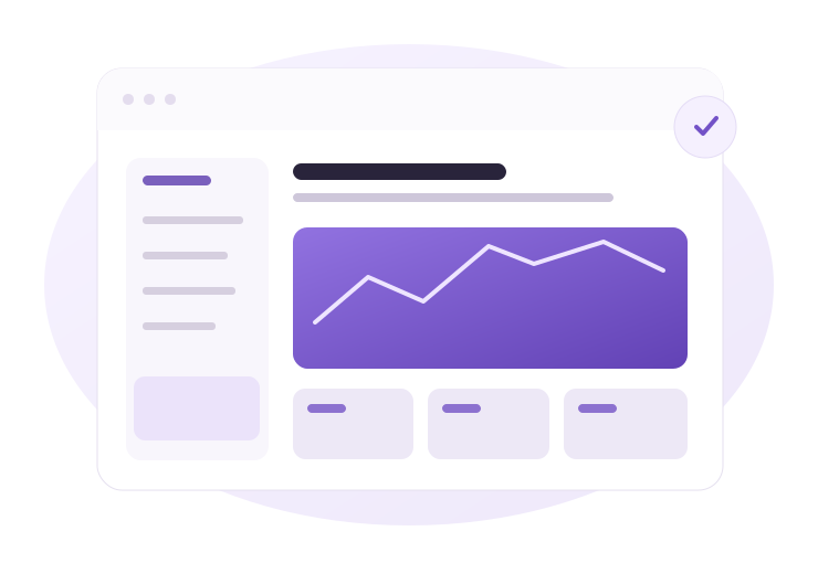
Keep decorations restrained so software functionality takes center stage, highlighting crucial information and actions.
Establish information hierarchy first; visual elements serve solely to aid comprehension.
Even across different screens, colors, spacing, and states must adhere to identical rules.
Use violet accents and motion intentionally only to guide attention to key focus areas.
The visual personality of SILENCE embodies composure, precision, and confidence. Below is the official SILENCE logo. Preserve original proportions and colors with transparent backgrounds.
SILENCERely on generous white space, subtle violet accents, and articulate typography. Avoid aggressive neon hues, excessive gradients, and heavy drop shadows.
Never arbitrarily alter, re-color, or distort the proportions of the official logo.
Define the semantic role of colors before hex values. Click any swatch below to copy its HEX code.
Primary is reserved for main CTAs and active items. Soft serves as highlight backgrounds. Provide explicit text alongside error and success colors.
Pretendard for Korean and Inter for Latin are preferred. Uninstalled devices fall back seamlessly to clean system fonts.
Communicate product utility and user goals clearly. Body typography defaults to 16px with ample line-height.
Never shrink body font simply to cram more text. Secondary captions should remain at least 14px.
Utilize a 4px base increment spacing system and disciplined corner radii. Standard content width is 1200px; article body defaults to 820px.
Interactions with matching intent must retain the same anatomy. Primary buttons belong strictly to the single highest-priority action per view.
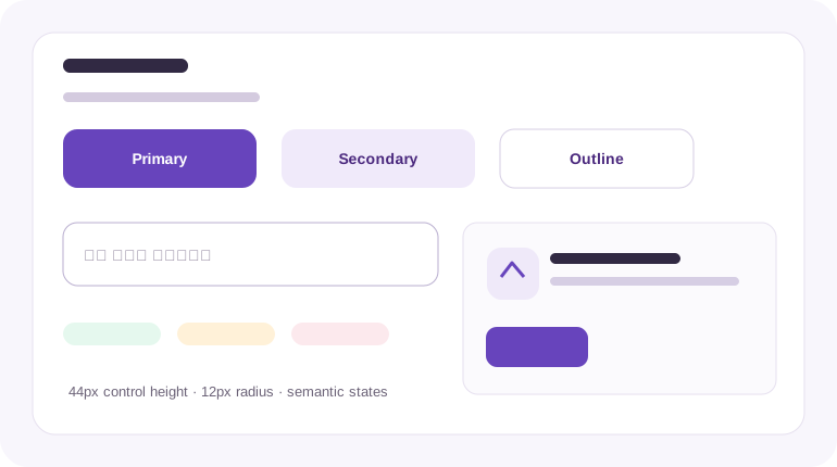
Primary · Secondary · Outline
Buttons/inputs min-height 44px, default radius 12px, cards 16px with 24px padding. All interactive elements must explicitly distinguish active, disabled, and focus states.
Design motion to clarify state changes rather than to display animation for its own sake.
Focus on subtle background and border transitions.
State and panel transitions remain calm and measured.
Reserved strictly for essential content entrance.
Keyboard focus indicators must always remain visible; respect user reduced-motion preferences by dampening animations.
On small viewports, collapse sidebars into drawers and collapse multi-column layouts into single flows. Preserve touch targets at 44×44px minimum.
Single-column layout · Collapsible navigation drawer · Full-width cards
Two-column flexibility · Content-first hierarchy · Streamlined navigation
Sticky table of contents · Constrained reading widths · Generous margins
All assets are crafted exclusively for SILENCE with explicit rights. The official logo utilizes the verified transparent PNG, and interface illustrations are bespoke vector SVGs.
Official logo/uiux-guide/silence-logo.pngInterface artwork/uiux-guide/hero-interface.svgComponent illustration/uiux-guide/component-sheet.svgLabel concept visuals clearly to avoid confusion with live production software. Employ purposeful filenames and reference assets via valid relative paths.
Designed targeting WCAG 2.2 AA conformance. Beyond contrast ratios, validate through actual keyboard traversal and screen reader audits.
Aim for at least 4.5:1 for body copy; 3:1 for large display titles and primary non-text graphical boundaries.
Ensure complete keyboard navigability; distinctively differentiate active view position from cursor focus.
Never rely solely on color to convey status; accompany success and error indicators with plain semantic text.
Strictly honor operating system reduced-motion preferences.
Design guidelines hold no value if code diverges from intent. Review every item below during design audits and staging QA.